 MeyhoraMeyhora
A bold, human hero for a brand and web design studio, designed to say what the studio does for clients in the first few seconds.
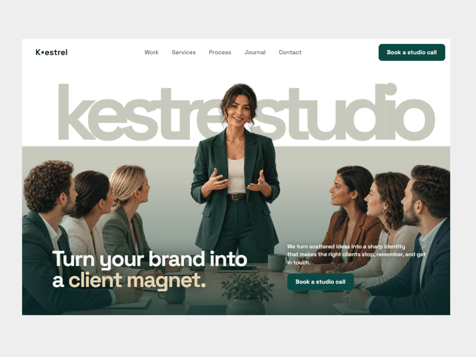
Many creative studios open with a grid of past work and a line about “crafting brands.” It looks good, but a business owner landing on the page can’t tell what changes for them if they hire the studio. The studio needed its first screen to speak to the client’s goal, not its own taste: sharper brands that bring in the right clients.
We led with the outcome. The headline, “Turn your brand into a client magnet,” says what the visitor gets in plain words. The studio name is set large behind the people in the photograph, so the brand is memorable before anything is read. The photo shows the team in conversation with a client, which says “we work with you” better than a studio portfolio would. Everything is in a cool, quiet palette of mist white, deep teal-green and sand, with one primary button, “Book a studio call,” so the next step is never unclear.
A homepage hero with a simple navigation (Work, Services, Process, Journal and Contact), a "Book a studio call" button in the header, and a headline that states the benefit directly. Beneath it, one sentence explains the offer: an independent studio that turns scattered brands into sharp identities and websites built to bring in the right clients.
The same call to action appears in the header and beside the description, so a visitor can act at the moment they're convinced.
The headline is written from the client's side, about their brand and their clients, not the studio's awards. The photograph does the rest. It shows a team in a real working conversation, which signals a collaborative studio, and the large wordmark gives the page a confident, memorable first impression. We kept the colour palette restrained so the photo and the headline stay the focus.
We designed it for a small studio that sells both brand identity and website work, and wrote the copy in plain, direct language. There was no client for this one, so the studio name, copy and photography are invented for the concept, and the images are AI-generated.
The result is a first screen that tells a prospective client what the studio will do for them and gives them a single way to start. Kestrel is a concept project that shows how we approach studio and agency websites. For a real studio, the next step would be work pages, case studies and a booking flow, built on the same look.
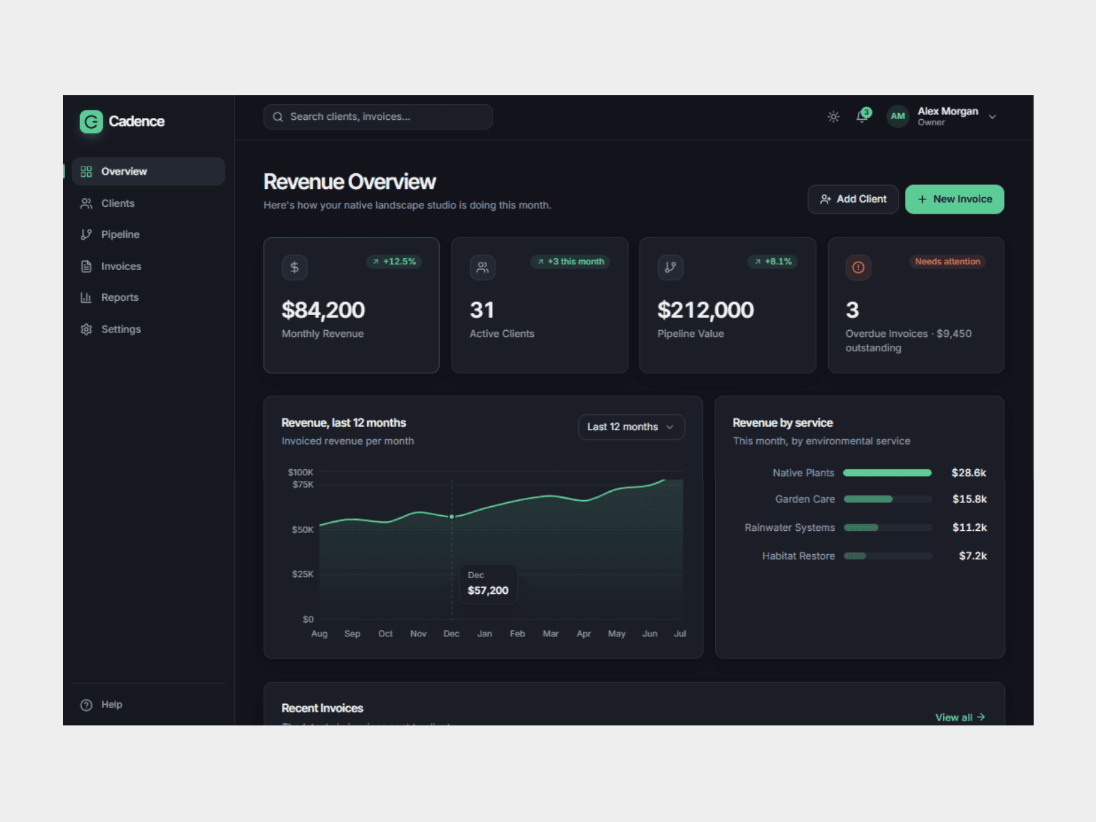
A clear, one-screen dashboard for an agency owner, built to show what’s been earned, what’s coming in, and what needs chasing.
A small agency (concept)View project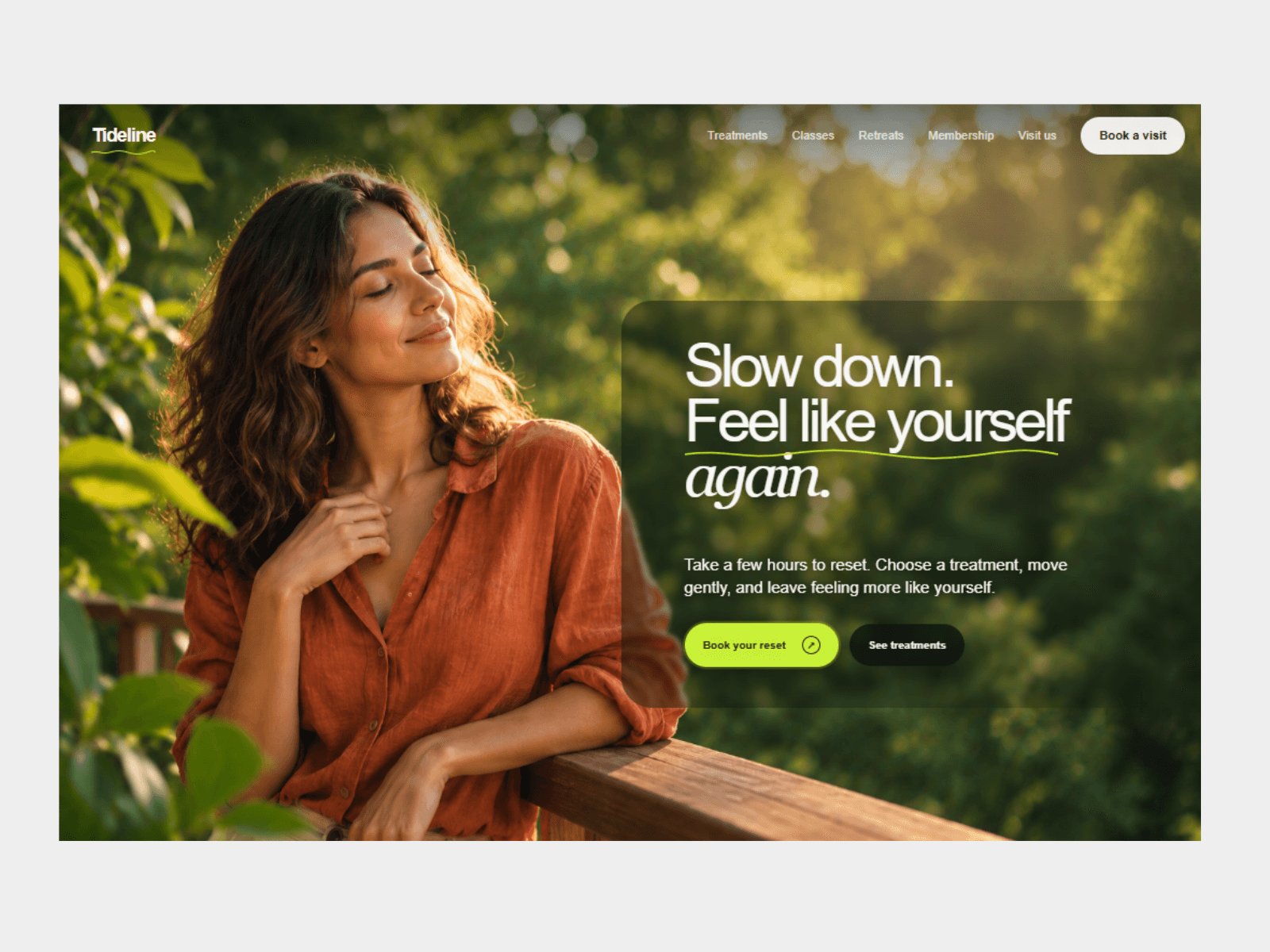
A calm, photo-led hero for a boutique wellness retreat, designed to take a visitor from “this looks peaceful” to “book a visit” in one screen.
Tideline View projectTell us what you are building. We reply within 1 business day with a clear next step.